Pollster
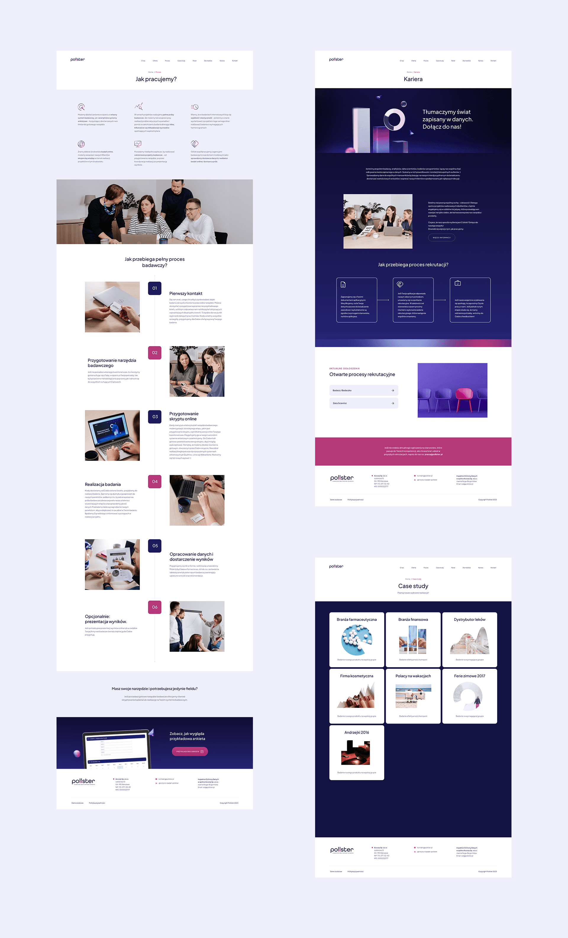
Polish market research institute with over 12 years of experience. The project covered a full visual refresh - logo redesign, brand guidelines, business cards, 3D modeling, website and infographics.
Client
Pollster Institute
Services
Visual Identity
Logo Design
Brand Guidelines
Print Design
Web Design
3D Modeling
Industries
Research & Data
Date
2023-2024

The challenge
The existing logo used a serif typeface that felt dated and didn't reflect the company's data-driven, professional positioning. The colour palette - magenta and grey - lacked a strong enough counterpart to carry the brand across diverse communication materials without feeling either flat or overly playful.

Logo & Typography
The serif was replaced with Plus Jakarta Sans - a geometric, confident typeface that holds its weight at any size. The double L in the wordmark was redesigned as a bar chart motif, embedding the brand's core language directly into the logo. A deep navy was introduced as a third colour alongside the existing magenta, adding authority and credibility to the system.
From business cards to branded merchandise, the system was built to work across print and physical touchpoints.


Concept applications showing the identity at scale, from outdoor advertising to conference environments.


Motion & 3D
The visual identity extends into motion. A set of 3D geometric forms - referencing data structures and analytical thinking - was developed as a flexible asset for presentations, digital campaigns, and event visuals.


Website
The visual identity was extended into a full website design, bringing the navy and magenta system into a digital environment. Designed in close collaboration with the development team.